R.A.C.E to success: A strategic framework to win at SEO
SEO can be broken down into clear, repeatable steps.
We know that:
- Content is king and user experience is queen.
- Google wants us to create unique, relevant, comprehensive content so that searches can find exactly what they are looking for.
- Websites should load fast and make it easy for users to perform their desired actions.
- The content and experience of the site should be worthy of being mentioned and linked to by other relevant, authoritative websites.
In this way, optimizing for SEO can be distilled into four stages:
- Research
- Audit
- Create
- Empower
Want to learn a repeatable, step-by-step marketing program that will allow you to develop and implement a successful digital marketing strategy? This will be the first article of a new series that will deliver just that. This article will provide a general outline of the “what” and “how.” Future installments will go into much more detail.
Research (reboot, raid, realign)
Before starting any SEO campaign, you need to spend a significant amount of time researching.
Here are a few key elements to examine at the start of any campaign:
- Baseline research:
- What: How is the site currently performing? What keywords are you currently ranking for? How much traffic is the site receiving monthly?
- How:
- Semrush Domain Overview
- Semrush Organic Research
- Semrush Benchmark Report
- Competitor analysis:
- What: Start by identifying who your top competitors are. Then, perform a gap analysis to see what keywords they are ranking for and that you aren’t, and vice versa. At this stage, do some backlink sleuthing too.
- How:
- Semrush Keyword Gap
- Semrush Organic Research
- Semrush Saved Report
- Semrush Backlink Analytics
- Keyword research:
- What: Having looked at the keywords you are currently ranking for, what keywords your competitors are ranking for, and having a clear understanding of your target audience and buying stages, it’s time to build your keyword list.
- How:
- Semrush Keyword Magic
- Semrush Keyword Gap
- Semrush Organic Research (Competitors)
- Google Search Console
- Google People Also Ask
- Google Search Suggestions

- Target audience research:
- What: Who is your target audience, and what do they look for at every stage of the buying process? At this stage, you’ll want to create buyer personas and map out their buying journey.
- How:
- Customer Service Data
- Google Analytics Demographic Data
- Surveys

Audit (analyze, align, activate)
Now that all the background research is complete, it’s time to move on to the auditing stage. You’ll need to perform several audits to ensure your site has all the correct elements.

- Technical SEO audit:
- What: You’ll need to run the site through several tools to understand how the code is built and how it impacts performance and rankings. You can use multiple tools to get a comprehensive list of data points and then send these findings to the relevant team members.
The number of data points in performing a technical audit could be endless, so we will focus on some of the most important ones that will make a significant difference when optimizing for Google.
- How:
- Tools:
- Semrush Audit
- Screaming Frog
- SiteBulb
- Critical CSS
- Cloudflare
- GTmetrix
- Pingdom
- Website Auditor
- Google tools:
- Google Lighthouse
- URL Inspection
- Structured Data Markup Helper
- Rich Results Test
- Chrome Dev Tools
- Tools:
- What: You’ll need to run the site through several tools to understand how the code is built and how it impacts performance and rankings. You can use multiple tools to get a comprehensive list of data points and then send these findings to the relevant team members.
- Content audit:
- What: Unless you’re launching a brand new website, you will likely inherit a lot of “content baggage” when you do SEO for your website. Your website may have hundreds of outdated pages or pages that are not receiving any traffic and bog down your content score.
It’s common for people to cannibalize content, which means they have multiple articles targeting the same keywords. Thin content is also very common, including pages with little to no text or does not cover a subject comprehensively.
- How: Use Screaming Frog or Semrush to create a list of your site’s page, add metrics and analytics data, and label pages to keep, delete, revamp or consolidate.
E-A-T audit
- What:
- Expertise: topic expertise for an author
- Authority: inbound links, social followers, inbound links, citations, social shares, topic authority
- Trustworthiness: SSL, contact info, privacy and disclaimers, refund policy, about us page, links to authorities, credentials on about page
- How:
- What:
- Backlink Audit:
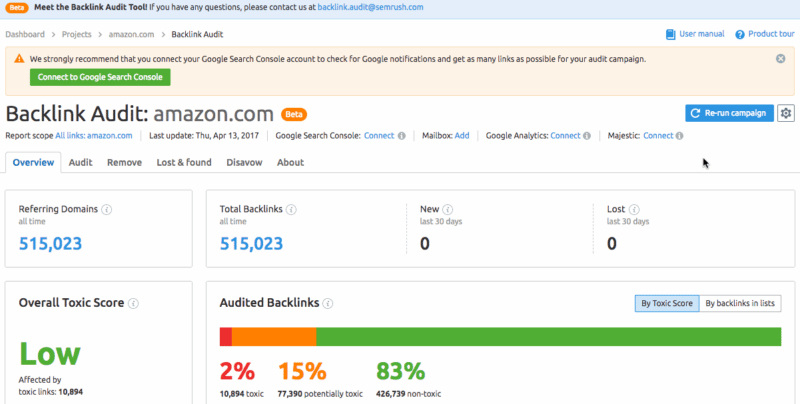
- What:
- Does your site have toxic backlinks? Do you have a disavow in place? Has your site been the victim of a negative SEO attack? If you have toxic backlinks, your rankings could be suppressed.
- How:
- Semrush backlink audit: Start by running the links using their filters and send every link to the disavow or whitelist. Once done, review any that weren’t part of a pattern. Finally, run both the whitelist and disavow list through a metrics finder so you can check if any can be moved over. When done, export to disavow and upload to Google Search Console.
- Analytics audit:
- What:
- Is your GA set up properly? Are you tracking conversions and/or goals? Do you have funnels set up? Do you have call tracking installed and working? Are you a/b testing and launching the pixels correctly?
- How:
- Review your Google Analytics account and make sure all of the above is set up properly.
- What:
Create (captivate, capture, compel)
Now that all of the foundational research is in place, you can move on to the fun part: creating captivating, compelling content.
Build your editorial strategy:

- What:
- Create an editorial strategy including the keywords from your KW research, trending topics, and content that addresses each target persona’s top, middle, and bottom of the buying stages.
- How:
- Plan:
- Determine Cadence: How often will you publish?
- Determine Resources: How many writers/editors are available?
- Determine Formats: Micro-posts, Long-form posts, infographics, video graphics, ebooks, tutorials?
- Trending Topics: Use Feedly, BuzzSumo or Google News to create a list of relevant, trending topics.
- Editorial calendar:
- Based on the cadence, assign a keyword or topic to each deadline/due date. Make sure you cover all target personas, buying stages, and relevant keywords.
- Manage:
- Editorial workflow
- Add details to each content order: Primary and Secondary keyword, URL/meta title/H1, length, content type, author, author due date, scheduled to publish date.
- Review content for readability, check for keyword inclusion, add similar keyword variants and check for the use of bullets and paragraphs.
- Check for duplication of content.
- Review for on-page SEO elements.
- Make sure there are outbound links to authoritative sources.
- Add links to other relevant pages of your site.
- Publish
- When publishing, make sure the article doesn’t have any formatting errors and that all of the on-page SEO elements are in place.
- Editorial workflow
- Track:
- Create an experiment/annotation with the publish date to track the article’s performance at 60, 90, and 120 days.
- Optimize:
- Trending up/down: Perform monthly and quarterly audits where you optimize your pages that are trending up and down.
- Consolidate: Content that isn’t performing can be consolidated with content that is doing well.
- Update Meta Titles for CTR optimization using GSC
- Plan:
Outreach
- Link Building:
- What:
- With all of your content assets in place, you can start outreach to promote your content with other publishers, websites or editors. Use direct email and social media outreach to connect with other relevant sites. Offer them an incentive to get them to agree to link to your site.
- How:
- Manual: Build a list of targets by searching for relevant sites in Google, grab their email and social profiles, offer a content piece, link exchange, or just ask for the link, follow up on all conversations.
- Tools:
- Pitchbox
- What:
- Influencers and Brand Ambassadors:

- What:
- Many people already have popular sites that attract your target audience. Reach out to them and negotiate a partnership.
- How:
- Manual: Build a list of influencers and target them via email and social media
- Tools:
- Izea
- Buzzsumo
- Media:
- What: Reach out to the media to promote your content, events, or campaigns.
- How: Use Cision or other PR software to identify media members you can connect with.
Empower (engage, enthrall, earn)
Finally, you have all the building blocks to watch your website thrive and watch your traffic grow. You should be watching your site traffic, rankings and revenue increase at this final stage. You’ve done all the hard work and can now build on your success. At this final stage, you’ll want to focus on empowering your customers to trust you and become your customer.

Data analysis
- What:
- This stage is all about data-driven analysis and insights. You’ll have data coming from various sources. You want to focus on using that data to empower your consumers, buyers, brand ambassadors, sales team, and marketing teams at the empowerment stage. You’ll want to use data to determine the best keywords to focus on, campaigns that are resonating, brand ambassadors gaining traction, and more.
- How:
- GSC: Find pages or keywords trending up or down and optimize with additional content, keywords, inbound links, and visual assets.
- BuzzSumo: What pages/articles are getting lots of social shares? Create more relevant/similar ones, or do outreach on those
- Backlinks: What pages are getting lots of natural backlinks? What about your competitors? Look at these and surface those for increased outreach. Use Semrush backlink analytics to get this data.
- Conversions: Which pages are converting best? What elements do those pages have that you can replicate? Use Google Analytics to determine this.
Conversion rate optimization (CRO):
- What:
- Conversion rate optimization is critical at this stage. You want to start getting into the weeds of how users are interacting with your content, landing pages, and checkout process. Run continuous experiments so you can maximize all of your existing traffic and improve your bottom line.
- How:
- Vwo
- Optimizely
- Figpii
- Hotjar
- Heap.io
Monitor trends
You can never rest on your laurels when it comes to your SEO strategy. It’s important to continuously build content, outreach and monitor the performance of your website. Google is constantly changing its algorithms, so it’s important for you to keep monitoring trends and to modify your website accordingly.
Here are some of the biggest shifts:
- Voice and question-based queries. Smart devices, such as watches glasses and wearables advance, interactions with search engines may increasingly take place via voice. You should always be using questions as keywords and optimizing for voice search. Answers would come from the Featured Snippets and Knowledge Panels, so it’s increasingly important to get your pages ranking in these Google features.
- Quality over quantity, based on crawl prioritization. Crawl priority will become increasingly relevant and important as more content is consistently created and indexed. You may choose to produce fewer pieces of content but make sure those pieces provide the best, most comprehensive user experience. Promote your articles to build links as often as you publish content so that your link growth velocity is congruent with your content publishing ratio.
- User engagement signals, especially SPEED. Google introduced Web Core Vitals to break down the elements of site load speed, from “how quickly a page loads” to “how quickly do users see the first thing on the page”? How quickly is the page interactive? How quickly is the page fully functional?
- Indexing and crawl prioritization: The number of pages indexed grows exponentially, and Google is moving away from indexing everything to indexing quality content. They are prioritizing crawls to pages that are trusted and authoritative.
- Link building: Following their overall shift towards authority, receiving mentions from media and trusted sources will become increasingly important. If your friends all say you’re the best chef, everyone knows this can be biased. However, if people that don’t know you say you’re the best chef, this has more weight and value. Focus primarily on gaining authoritative links that your competitors don’t already have.
Deep dive
This article has given you an outline of the elements required to establish a successful SEO campaign. However, the devil is in the details.
The articles to follow in this series will go through each of the elements mentioned above, with in-depth information and processes to accomplish each of these stages.
The post R.A.C.E to success: A strategic framework to win at SEO appeared first on Search Engine Land.